
As the holiday season approaches, people are looking forward to all of the festivities it entails – such as opening an advent calendar each day for a pleasant surprise. However, people won’t only remember an advent calendar because of the product or gift they receive. They’ll also remember the engaging packaging and unboxing experience. JohnsByrne goes over the important elements of what to include in your advent calendar packaging design to create a memorable unboxing experience that leaves a positive impression of your brand.
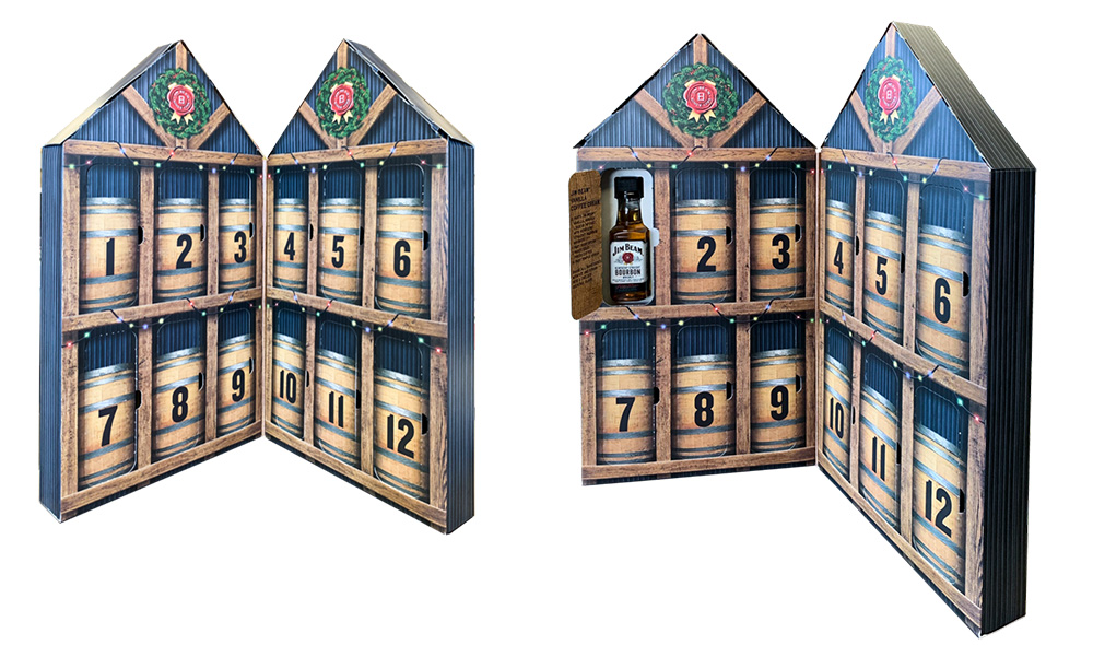
Unique and Seamless Structural Design
A unique structural design that is easy and intuitive to use will create a memorable and enjoyable experience for the customer.
The 2019 Kiehl’s advent calendar is a great example of an engaging, seamless design.
With the use of a VAC tray and a window, the calendar creates a “door-like” unboxing experience. Before opening, the advent calendar looks like a large, old-fashioned book. The packaging opens just as a book would as well. Once opened, the packaging reveals an incredibly beautiful imagery of holiday scenes in bright, playful colors and a pop-up structure brings the attention to the center. Each day, the customer opens a small number door flap that has a sample-sized product enclosed. All in all, the structure is easy to open and is intuitive to follow. It is also engaging, due to the bright imagery and the exciting door-like unboxing experience.
Another great example of a unique and engaging advent calendar design is the 2020 Kiehl’s advent calendar. The calendar is made as a book-style rigid box which opens from the center, with two sides that swing outwardly to create an elongated flat-surface box structure. Once opened, the structure reveals separate boxes, each box holding a surprise product, which creates a singular unboxing experience for each individual product. Each box fits together into the outer rigid box, creating a puzzle-like fit that, when put together, reveals imagery of one large continuous scene of a holiday party.

Seasonal Elements
It goes without saying that incorporating seasonal elements throughout will help elicit a positive response from your customers. Examples of seasonal packaging elements include:
- Colors associated with the holidays, including red, green, blue, and white
- Holiday imagery, such as Christmas trees, ornaments, and gifts
- Gold or silver foil
However, holiday-themed packaging should be deeper than the traditional Christmas deisgn elements. In order for your advent calendar to effectively resonate with your customers, you need it to emulate the true importance of the holidays – spending time with family, happy memories, and giving gifts and performing acts of service to others.
Furthermore, while you’ll want to incorporate seasonal elements into your advent calendar packaging, you don’t want to stray too far from your company’s branding. Mary Kay’s 2020 advent calendar did a great job of finding the perfect balance of a seasonal packaging and consistent branding. The advent calendar incorporated seasonal colors and imagery that is reminiscent of falling snowflakes. Additionally, the text “12 Days of Faves” is printed largely on the inside flap of the packaging is a fun play on the well-known phrase, “12 Days of Christmas.” While these seasonal elements are incorporated into the packaging, the advent calendar also largely covers the paperboard using their famous pink tones.

Storytelling Elements
Since customers will be interacting with your package for a consecutive number of days, you’ll want to ensure that your packaging continues to engage them until the end. Having your packaging tell a story is one way to effectively do this.
The Kiehl’s 2019 advent calendar does a great job incorporating storytelling into their packaging. As mentioned before, the advent calendar looks like a large, old-fashioned book. Once opened, there are short snippets of chronological “chapters” that, together, tell a story. The rich imagery follows this story and is detailed and visually-pleasing enough to engage on its own. By allowing the customer to follow along with the story each day, they are more likely to stay engaged throughout the entirety of the advent calendar’s use.

Get Started On Your Next Project Today
Have an idea for your next packaging project that you want to put into action? Contact us at JohnsByrne to get started on your next advent calendar design or holiday-themed project.
Related Posts
Each December, we look back at the packaging moments that sparked the most excitement, conversation, and inspiration across our community. Our 12 Days of JohnsByrne … ‘12 Days Of JohnsByrne Faves’ 2025 Holiday Packaging
In today’s competitive marketplace, a welcome kit is more than just a package—it’s the first tactile experience a customer has with your brand. Whether you’re … Welcome Kit Packaging: Making First Impressions Last
It’s another wrap on our 12 Days of JB Faves! Hopefully you’ve been following along with our social media posts to see the innovative holiday … ‘12 Days of JohnsByrne Faves’ 2024 Holiday Packaging