
One of the most important parts of packaging design is the color scheme. Because packaging is often the first impression of a brand that customers have, it is vital to get it right. The right color palette can help elevate a brand’s message while the wrong one can cause confusion and may repel consumers.
Here are some color palette trends we see industry-leading brands using successfully.
1. Brights
Bright colors have been an essential component of packaging since day one and will continue to occupy this spot moving forward. Bright and exciting color combinations have the ability to impact the mood of every audience immediately. Bright colors grab the attention of their audience, open their eyes, and bring a sense of excitement to the forefront. Because of this, bright colors have gradually worked their way forward. While they were once a background player, they are now a luminous and colorful cornerstone of many packaging designs.
2. Nude Palettes
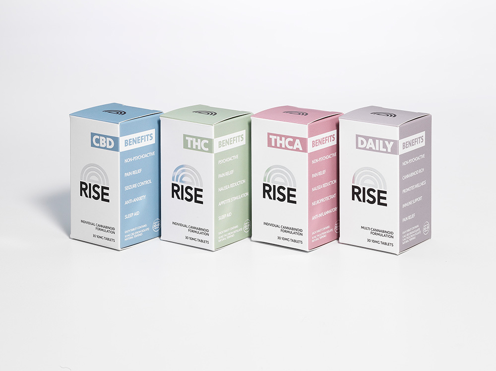
Nude palettes are a unique, innovative mixture of a variety of undertones. While the term itself references skin tones, some of the examples of nude palettes include mixtures of peach, rose, cream, chocolate, or even ochre. The industry has gradually made a shift towards nude palettes in an effort to embrace a more minimalist look to their packaging. The ability to play with a variety of sepia, nude, and pastel palettes has given designers a new dimension when it comes to packaging. Expect nude palettes to rise in popularity as the drive toward minimalism grows stronger.
3. Black and Whites
Even though it might seem restrictive for a brand to use only two colors, black and white still offer a wide array of opportunities in packaging designs. The stark dichotomy that the two colors paint allows a packaging designer to create a dialogue out of these two colors. Because of the obvious contrast, this dialogue is impossible for any observer to overlook. Black and white packaging designs have proven powerful for numerous industry-leading brands.
4. Naturals
Over the past few years, there has been a drive from all industries to become more natural. There are numerous packaging designers who have used natural shades and colors to ground their designs; however, in recent years, many brands have been using a natural packaging design as a cornerstone of their delivery method. By using a natural packaging method, a brand can send the message that they have a sustainable vision, inspiring loyalty in the audience.
5. Matte Colors
Along the lines of being more “natural,” matte colors have seen a quick rise in packaging designs. Many people associate matte colors and packaging with minimalism and naturalness. In a world where the consumer is savvier than ever, this matters. Furthermore, in the few seconds that the audience often takes to make their decision, it is important for the packaging design to stand out. Matte colors can still help a brand stand out among the competition and get noticed.
6. Greens
Green is one of the most popular packaging trends in two different ways. First, “green” is associated with being environmentally friendly and sustainable, which resonates with savvy customers. While this is important, green color in the packaging can send the same message. Many brands are incorporating the color into their packaging design as a way to start a dialogue with the audience. The color green grabs the attention of the audience and communicates environmental sustainability.
7. Gradients
Gradients continue to grab the attention of both designers and customers alike because of their ability to give designers the ability to create something innovative out of a traditional design. By blending various colors, brand designers are able to create a revitalized, gradient design. Furthermore, gradients have also transitioned well into the digital age. Over the past few years, gradients have only become more and more popular. Moving forward, gradients will continue to be a cornerstone element of packaging design, adding a new dimension to almost any packaging format.
Relying on the Help of the Professionals
In order for brands to compete in the modern environment, it is important to make a strong first impression. This is where the packaging design is more important than ever before. Rely on the professionals at JohnsByrne to help your brand send the right message. Help your product stand out from the crowd with a high-quality packaging design that is impossible to ignore.
Related Posts
In the evolving premium spirits market, packaging is more than a protective layer, it is a key brand ambassador. Secondary packaging including folding cartons and … Premium Spirits Packaging: Trends Shaping the Future
As e-commerce continues to expand and the retail environment—in terms of brand display—grows ever more sophisticated, it’s essential for brands to stay on trend with … Premium Packaging Solutions: Following Trends with Real Brand Impact
For companies looking to improve their bottom line, packaging can be a prime target for cost reduction. However, cutting packaging costs is often a balancing … Mastering the Balancing Act: Proven Strategies for Reducing Packaging Costs While Boosting Innovation