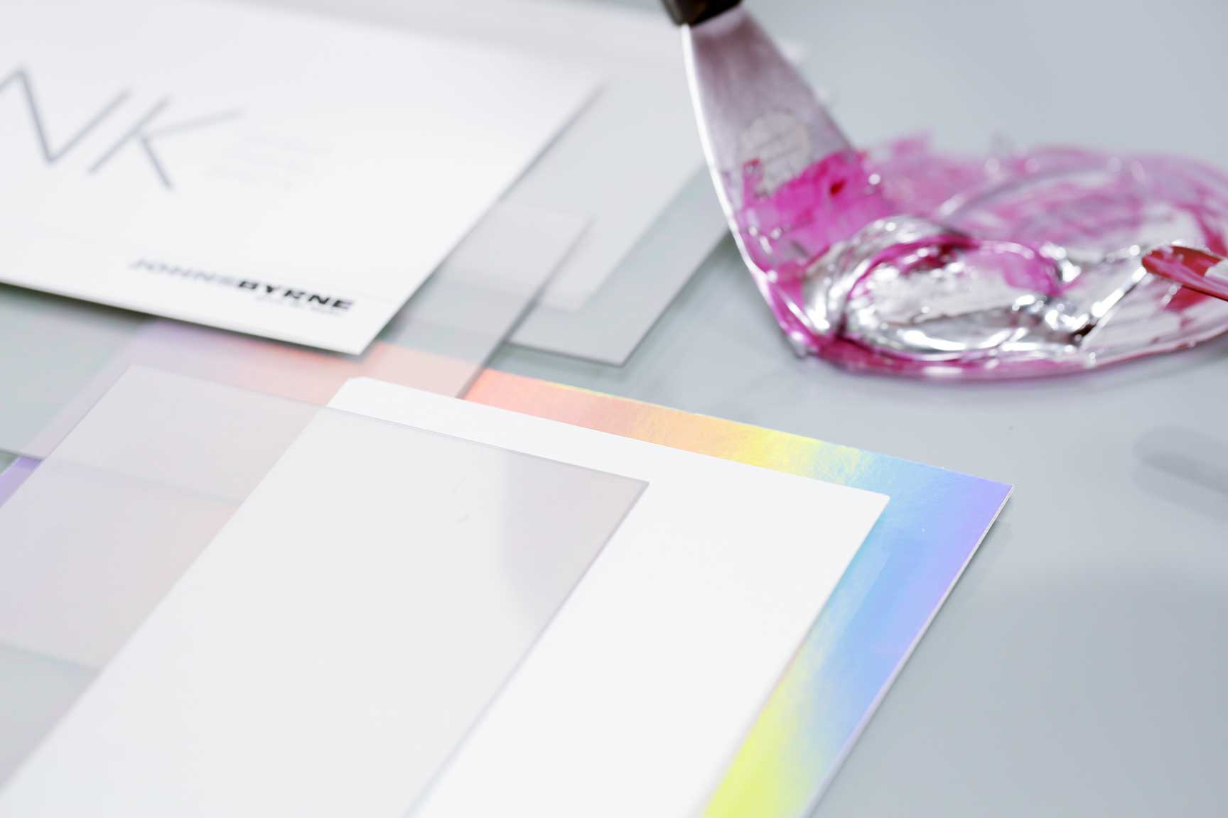
It is important for print and packaging providers to take every measure possible to get color-matching right across your packaging. The consistency of color is critical across a brand, and can both negatively and positively impact your brand, depending on the quality of the outcome. JohnsByrne explains why color matching is vital to a brand’s packaging and the benefits of using the right color matching system for your designs.
Color Matching Challenges
The color matching process begins in the early stages of client collaboration. During this proofing process, customers will have selected unique PMS colors, or a CYMK color combination of their liking. Oftentimes, customers have examples to share, whether it’s the color of a lipstick or a brand PMS color. However, these colors are going to behave differently on various substrates. Some of the factors include:
- Using coated paper vs. uncoated paper, the latter of which can absorb inks
- The type of print effects being used such as pearlescent coating, glitter coating, or raised UV coatings, all of which can impact the appearance of the final product
- Printing on paperboard vs. plastic, which can impact gloss and shine
Why is Color Matching Important?
Color matching is a very important factor for designers to carefully consider, as your packaging design’s color consistency (or lack of) can greatly impact your brand and sales, either positively or negatively.
Color Communicates
For one, color is an important and immediate way for brands to communicate a message to consumers. Not only can color help your product stand out amongst competitors, but it is one of the first things consumer’s notice – before shapes or information printed on the packaging. With color being such an impactful aspect of packaging to consumers, it’s important to make sure it is consistent across all SKUs and product lines. Consistent color helps promote reliable branding, which helps your brand gain trust amongst consumers.
Color Consistency is Brand Consistency
Secondly, it has been proven that the human eye can perceive even the slightest differences in color – so consumers will be sure to notice if your packaging is inconsistent. Even the smallest inconsistences in packaging color can negatively impact the consumers perception of the product that it holds. In fact, according to a study by Management Decision, people make an opinion on a product within the first 90 seconds of interacting with it – and, depending on the consumer, about 60-90% of that judgement is based on color alone. Therefore, in the eyes of the consumer, inconsistent packaging can lead consumers to believe that the product is flawed or of lower quality.

Different Types of Color Matching Systems
There are two main color matching systems used in print. One system is the CMYK system, which stands for Cyan, Magenta, Yellow and Black – the primary colors for print. CMYK is often referred to as 4 Color Process, and this system uses varying combinations of these 4 colors to create endless color options.
The second color matching system, Pantone Matching System (PMS), uses standardized colors that are depicted the same way for all manufacturers worldwide.
CMYK vs. Pantone Matching System: Benefits
There are a variety of benefits to using both systems; the right system for you depends on the type of project that is in the works, as well as what you are looking for in a process.
Brands may want to use CMYK for their packaging design when:
- The packaging is using more than 8 colors
- You are looking for a more cost-effective solution
- The design includes printing of photo-like or cartoon-like artwork
On the other hand, the Pantone Matching System may be best for your design if:
- Your design uses less than 8 colors
- Your design uses black and a unique brand color (PMS has the ability to create precision throughout the entire printing process, while CMYK may have difficulty doing so with uncommon colors)
- Your design uses bright, sharp colors
- You are creating a new logo design
- Your design will be printed on a variety different types of materials, as PMS can ensure more consistent coloring amongst these different substrates
Printing with the Latest Technology
At JohnsByrne, we use the G7 Master methodology to make sure that we provide our clients with color-matched products to meet their needs. Our pressroom is equipped with the latest prepress proofing and plating process and technology, and we continue to apply the latest developments in color theory and ink technology.
Additionally, in order to bring your project to life and follow your exacting specifications, we can process complex and varied file types for multiple proofing methods. All of our proofs are marked with G7 approval in order to ensure compliance and color matching to your important targets.

Find the Right Partner to Meet Your Brand’s Needs
A crucial component of creating a high-quality product is working with the right print and packaging supplier. No matter the color matching process that you use, the right supplier will provide you with the tools and guidance you need to create a successful project. Contact us today to learn more about how we can help you!
Related Posts
As e-commerce continues to expand and the retail environment—in terms of brand display—grows ever more sophisticated, it’s essential for brands to stay on trend with … Premium Packaging Solutions: Following Trends with Real Brand Impact
For companies looking to improve their bottom line, packaging can be a prime target for cost reduction. However, cutting packaging costs is often a balancing … Mastering the Balancing Act: Proven Strategies for Reducing Packaging Costs While Boosting Innovation
Ever since the first cave paintings and sharing of tales around the campfire, we humans have been obsessed with sharing experiences as vividly as possible. … Where Customer Experience Meets Social Media Buzz: Leveraging Unboxing Videos for Your Brand
