
Your packaging is the heart of your brand. Everything about it, from the shape to the color, must have careful strenuous thought put into it. Certain colors evoke different emotions. Emotions that can work in your favor. If you pick the perfect color for your packaging, your product will be flying off the shelves with your ideal customers in no time.
85% of people state that color is a huge factor when making a purchase. The psychology of colors is a science that studies brain patterns when people see certain colors. Every color of the rainbow causes a different emotion. For example, red invokes urgency and kick-starts metabolism. That’s why you tend to see a lot of fast food restaurants and clearance sales incorporating red into their logos and signs. Using this science to better your packaging is easy. We’ll take you through this science color by color to get a great insight into how to make sure your packaging is invoking the preferred emotions in customers.
Here’s how to target specific emotions using color with your packaging.
Red
The color of passion. Red is one of the most used colors in marketing. It invokes a high sense of urgency and encourages customers to buy impulsively. It brings a sense of warmth and excitement.
The entertainment industry incorporates a lot of red into their packaging too, taking advantage of the urgency, excitement, and immediate satisfaction emotions red evokes. For example, this Blu-Ray packaging for Iron Man 3 incorporates large amounts of red, perhaps to encourage a sense of action-packed excitement that the audience will feel when watching the movie.

Orange
Orange evokes similar emotions to red. The primary emotions orange brings about are excitement and enthusiasm. Orange is a great color to attract impulsive shoppers and establish a friendly and confident brand.
Like red, orange packaging is best when targeting customers that want immediate satisfaction. Incorporating orange into your packaging will target impulsive shoppers and establish a sense of kindness to your brand. Take a look at the orange accents incorporated into this Walmart packaging. Everything about this packaging promotes warmth, cheer, and kindness.

Yellow
Like orange, yellow is known to increase cheer and warmth. Its bright color can cause strain on the eyes though, so be cautious when incorporating this color into packaging. A bright yellow often upsets babies, so maybe go for a softer color if you’re packaging a baby product.
The most important emotions yellow evokes is clarity and a sense of youthfulness. This sense of youthfulness can be used in your favor in packaging. It’s especially useful when packaging beauty products for older individuals. One of our clients, Kiehls, promotes optimism and youthfulness with their Daily Defense oils packaging.

Green
The color green emphasizes earthiness and eco-friendly sensations. It evokes the emotions of health and relaxation. It’s often associated with prosperity and is known to ease depression.
Green in packaging is most commonly incorporated into eco-friendly and minimalistic brands. If you’re looking to establish your brand as active, tranquil, or environmentally sound, green is perfect for your packaging.
VENeffect incorporates green into all their packaging. VENeffect is a plant-based, healthy, anti-aging skin product. They chose green as their packaging color to further promote a sense of health, tranquility, and environmentally friendly values.

Blue
The color blue reflects the serenity of water. Blue evokes peace, calmness, and positive productivity. This is why it’s the most common color used in office places. Using blue in packaging is best if targeting males. The color blue is a common preference of men, hence the large number of men’s products, like shaving creams and deodorants, packaged in blue colors.
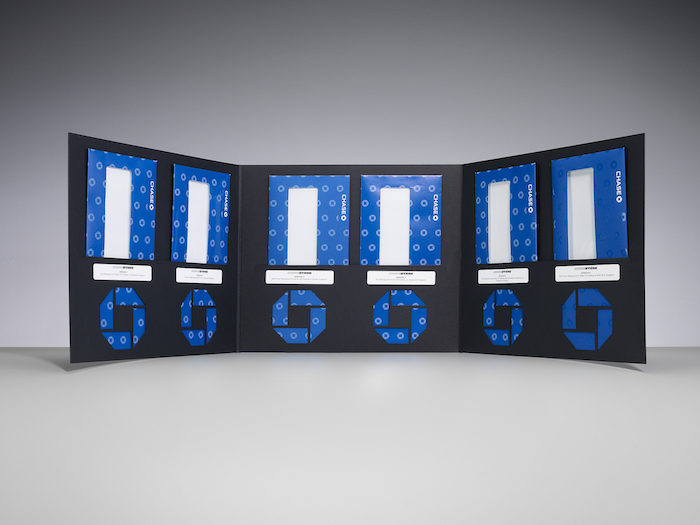
If you’re looking to create trust in your brand, blue is perfect for your packaging. Blue’s calm presence provokes a sense of reliability and dependability. Plenty of banks and tech companies use blue to evoke this emotion. Chase incorporates blue into all their packaging and branding to promote a sense of reliability and dependability to their customers.

Purple
Purple has always been a color of the elite. It raises a sense of success, creativity, and wisdom in a brand. Purple tends to soothe and calm customers. Incorporating purple into your packaging can attract customers looking for a brand with promise.
Purple is often used in anti-aging creams and other skincare packaging designs. doTERRA’s Baby Box incorporates purple into many of their essential oil products. The purple touch establishes doTERRA as a promising trusted brand while promoting a soothing and calm presence. These factors are extremely important for parents’ purchasing products for their newborn.

Black
Black is an extremely popular color in packaging. Black is a traditional symbol of power and authority. It’s used to invoke a feeling of elegance and extravagance. It can create a sense of intelligence and strength for your brand.
If you’re looking for a way for your brand to join the elite, black packaging may be the solution. For example, Yves Saint Laurent, a luxury fashion brand, uses black in almost all of their packaging. The all black packaging with gold accents promotes luxury and high-class.

White
White, one of the most basic colors to package with, has a lot of purpose in packaging. Throughout time, white has been associated with purity, cleanliness, and neutrality. It’s a great packaging color for a minimalist brand. When people see white, they think a product is pure and classic.
Effen perfectly embodies the emotions that white provokes. People want their vodka pure. The Effen white packaging promotes just that.

Color is a factor that can make or break your packaging. Keep in mind every emotion that a color evokes when creating the structural design for your next package. JohnsByrne is pressing the limits of incorporating color psychology into packaging. If you’re interested in creating an innovative custom packaging that incorporates color psychology, contact us today.
Related Posts
In the evolving premium spirits market, packaging is more than a protective layer, it is a key brand ambassador. Secondary packaging including folding cartons and … Premium Spirits Packaging: Trends Shaping the Future
As e-commerce continues to expand and the retail environment—in terms of brand display—grows ever more sophisticated, it’s essential for brands to stay on trend with … Premium Packaging Solutions: Following Trends with Real Brand Impact
For companies looking to improve their bottom line, packaging can be a prime target for cost reduction. However, cutting packaging costs is often a balancing … Mastering the Balancing Act: Proven Strategies for Reducing Packaging Costs While Boosting Innovation