
The color palette of packaging designs plays a critical role in determining a customer’s first impression of a brand or product. Color plays an important role in determining emotions and influencing behavior. On a yearly basis, the Pantone Color Institute selects an annual Color of the Year, something it has done for the past two decades. This year, the Color of the Year is coral, specifically “Living Coral.”
Thoughtfully applied, the Color of the Year can help brands stay on top of trends and consumer’s expectation for the new and fresh. In 2016, for example, Rose Quartz was the Color of the Year. Colloquially named, “Millennial Pink,” Rose Quartz has been penetrating many industries. From fashion to interior décor and even electronics, rose elements are found everywhere now.
Why Living Coral
According to Pantone, Living Coral is the Color of the Year for 2019 because it is an animated color that reflects life, despite its softer edge. This year’s Color of the Year represents the fragility and beauty of the Earth’s oceans and marine life. With the threat being experienced by the coral reefs all over the world, the color is a reminder of the importance of a healthy environment.
With such a huge push for environmentally friendly packaging lately, Living Color was the perfect fit for this year’s color of the year. Living Coral brings the beautiful colors of coral to everyday retail. Brands are embracing this emphasis through packaging that not only reminds about sustainability through color, but the physical packaging is sustainable.
With Living Coral already making a name for itself in numerous packaging designs this year, it’s important for brands to understand how colors and consumer psyche are intertwined.
Living Color and Consumer Expectations
With the rapid progression of technology and artificial intelligence, many people are craving warmth and humanism. This year’s Color of the Year, Living Coral, reflects that warmth. The majority of shoppers spend a tremendous amount of time online, particularly when it comes to social media. It is important for businesses to capitalize on this. Pantone’s Living Coral reflects warmth and humanism which is likely to draw the attention of shoppers. Living Coral is also sociable, spirited, and lighthearted. All of this is important in influencing the consumer psyche, making the shopper feel warm, welcome, and desired.
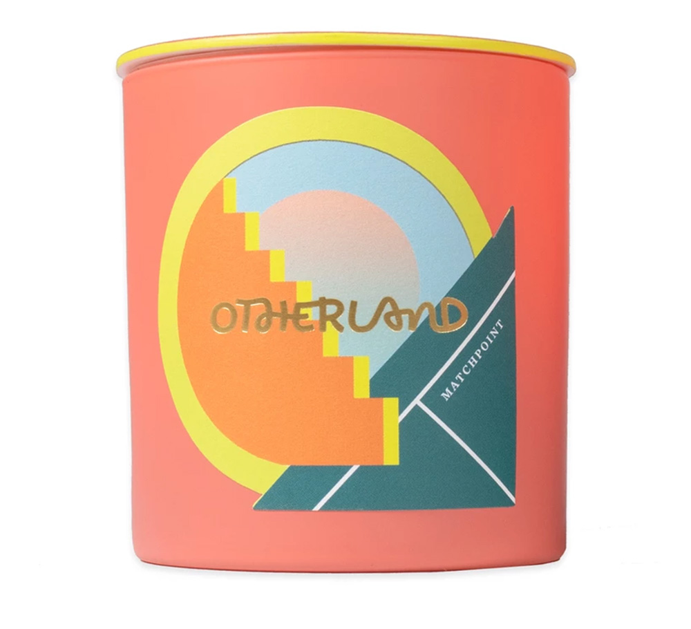
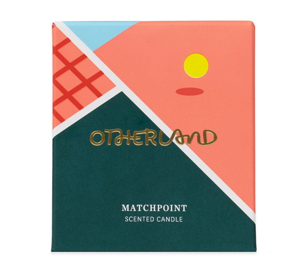
This year, JohnsByrne capitalized on Pantone’s Color of the Year with this stunning design for this Otherland Matchpoint Candle. The incorporation of Living Coral paired with other welcoming, colorful elements exhumes the true feeling of warmth that Living Coral represents. The design also calls on Earth’s beauty, just as Living Coral does, with a detail of a Sun setting over a blue sky in the background.
Packaging Applications of Living Color
Gradients
Another trend in packaging designs in the past few years has been a movement toward gradients. Living Coral is a warm color that will match well with other warm colors to form a soft and inviting gradient. Think about reds, oranges, and yellows that can blend well with Living Coral. Combined, these colors can form a gradient that will create an inviting feel that will grab the attention of the shopper without creating an edge.

Nomikai presented the fusion of Living Coral and gradient perfectly in this recent design. This design slightly fades from coral to white creating an inviting aesthetic. It’s the perfect example of how to entice a consumer without being too distracting.
Pops of Color
Staying fresh and on-trend can be easily done with pops of color that easily intertwine a well-known brand identity. Adding a pop of color in the Color of the Year such as a band, florals, or setting it as the background can easily upgrade any package and make it instantly on-trend. The mere play of color also adds warmth and playfulness, making a packaging design more inviting.
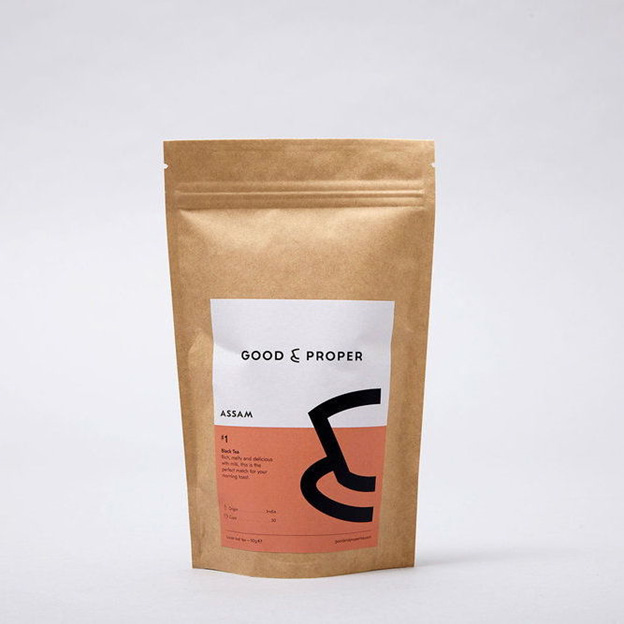
Good & Proper hit it on the nose with this Living Coral accent. This otherwise mundane packaging is livened up by a simple accent of coral in their tea packaging. Good & Proper prides itself on selling the perfect cup of tea and their packaging must exemplify this. The perfect harmony of simplicity and eye-catching color creates a perfect formula for an eager consumer to grab this item off the shelf.
Color Elements
Another sophisticated way to give packaging a refresh with on-trend colors is to simply apply elements of that color to its design. Living Coral, for example, is intended to represent the coral reefs. Adding elements of the nature of the color can itself enhance the design without having to be too representative of the color of the year. Simple graphics and even structure and shape can align with the Color of the Year.
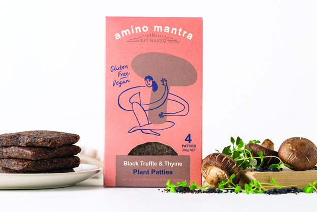
Amino Mantra uses this tactic perfectly in it’s gluten-free, vegan plant patties. As we stated, Living Coral is a color that brings upon feelings of nature and Amino Mantra pulled on this color to exemplify its product’s alignment with nature, sustainability, and a healthy lifestyle. The playful design of a woman embracing a mushroom is memorable and exemplifies the core value of the product and Living Coral.
The Importance of Colors and Consumer Psyche
Color trends, and staying on-trend, can easily impact consumer sales. Staying up to date on the latest color strategies and trends, particularly with the importance of social media today, is key for any brand. Brand and consumer awareness are intertwined and play a critical role in the consumer psyche. All of this plays an important role in customer acquisition and sales. In order for brands to make the most of color trends, it is vital to work with experienced packaging specialists to maximize the impact of product delivery. Reach out to JohnsByrne today to learn how this Color of the Year, and others, can be incorporated into your packaging designs.
Related Posts
In the evolving premium spirits market, packaging is more than a protective layer, it is a key brand ambassador. Secondary packaging including folding cartons and … Premium Spirits Packaging: Trends Shaping the Future
As e-commerce continues to expand and the retail environment—in terms of brand display—grows ever more sophisticated, it’s essential for brands to stay on trend with … Premium Packaging Solutions: Following Trends with Real Brand Impact
For companies looking to improve their bottom line, packaging can be a prime target for cost reduction. However, cutting packaging costs is often a balancing … Mastering the Balancing Act: Proven Strategies for Reducing Packaging Costs While Boosting Innovation