
The beauty industry is constantly going through cycles in the appearance, naming and messaging of brands. Although the best branding campaigns transcend fashion or trends, it is vital to be aware of fads as part of the brand development process in order to stay current and differentiate a company in the marketplace.
In analyzing trends in the beauty industry, packaging is a great place to start because even smaller companies will often invest heavily in their product packaging when compared to other aspects of a brand campaign. Product packaging is typically the first aspect of a brand a consumer interacts with, and can often influence the purchase decision.
Most people judge the quality of product by its unique packaging. In the competitive beauty market, you only have one chance to make a first impression. Make that first impression a creative and memorable one, with unique product packaging that will capture consumers’ attention quickly. Creative logos, unusual shapes, bright colors, striking text and textures are among the elements that usually catch the attention of consumers.
Let’s examine some of the top trends we’ve seen for 2015.
Studio/Professional Look
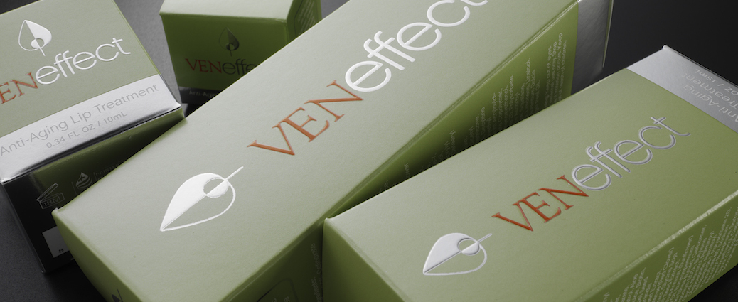
Echoing the design of big-box makeup retailer MAC Cosmetics, this type of packaging typically includes a solid black or dark gray color with the brand name and product information printed in a clean, white, modern typography. The logos have clean lines as well, with few icons or other embellishments, creating a very simple and intentionally basic look and feel. Smashbox, Lorac, Make Up Forever, Bobbi Brown and NARS also present this look with their product packaging.
Retro/Vintage
Another growing trend in beauty packaging today is a vintage-themed look, combining whimsical graphics with sassy copy. Pinup illustrations, retro colors and typography, and 1950s and ᾽60s elements are all part of this identity. Examples include Bare Escentuals’s Buxom Babes line and The Balm’s Hot Mama. These brand identities typically work best when clever copy and visuals work together in harmony. The prime example of this brand identity is Benefit Cosmetics’ Dr. Feelgood and Talk to the Tan products. Both create a witty and strong connection between the naming and imagery.
Eco-Chic
Eco-friendly packaging has accelerated rapidly over the past decade, to the point where it is no longer being seen as a trend. It is the result of a cultural shift in consumer demand. In many cases, products with green sustainable packaging often contain natural-based formulas or eco-friendly products. In the last few years, this has evolved visually from the predictable “earthy” look into more decorated and sophisticated expressions of nature. This is in direct response to the consumer’s shift in attitude. Since women demand more responsibility in beauty products, brands are creating beautiful customized packaging that happens to also be more responsibly produced. This creates a striking contrast between materials, finishes and colors.
Tarte, a very popular natural-based cosmetic line, creates healthy products with gorgeous packaging that is reusable and sustainable when possible. For example, the Glamazon Pure Performance 12-hour Lipstick comes in a bamboo casing with the packaging made from eco-friendly materials and decorated with colorful tribal prints that reflect the shade of the lipstick inside. And Physician’s Formula Bamboo Wear, a makeup line formulated with Bamboo Silk, makes use of contrasting graphics with a bright green bamboo pattern printed on top of the refillable bamboo compacts and packaging.
Gradient
This visual trend is quite simple, but effective nonetheless. These packages have straightforward, light-to-dark or color-to-color gradations as their primary identity. This visual effect can be seen on both primary and secondary packaging, along with clean minimal lines and structural design. Using the example of Sephora’s Pantone Universe line, the design takes on a more profound conceptual meaning, as the gradation design is suggestive of how Pantone colors can be customized through an ink screening process. This also relates to makeup application, as colors can be built up on the face, layer-by-layer.
At JohnsByrne, we work with leading health and beauty companies who seek the perfect combination of print and structural design to make their products’ packaging stand out in a cluttered marketplace. Our team collaborates with you early on during the structural design and concept phases to generate innovative ideas. Contact us today to talk about your ideas.
Related Posts
As e-commerce continues to expand and the retail environment—in terms of brand display—grows ever more sophisticated, it’s essential for brands to stay on trend with … Premium Packaging Solutions: Following Trends with Real Brand Impact
Ever since the first cave paintings and sharing of tales around the campfire, we humans have been obsessed with sharing experiences as vividly as possible. … Where Customer Experience Meets Social Media Buzz: Leveraging Unboxing Videos for Your Brand
Effective packaging is memorable to the consumer and sticks out amongst competitors. While bold colors and structures can help set your brand apart, creating a … How to Elevate Your Brand with Sensory Packaging